
The purpose of Assignment 3 was to use build on and develop learning from previous exercises; using observational drawing as visual research and further exploring the generation of ideas for illustration.
The assignment was in two parts:
- Visual research
- Developing a narrative
Key words from the brief:
Visual research
- Do some sketches that collect information about the figures and what they are doing, the location and any other elements that you think describe an activity or place
- Visual notation
- More considered drawings, or descriptive
- Add notes or words too if you think this will give you more information
Developing a narrative
- Take some of your drawings and develop them into a more narrative piece
- Make a note of some words that you want to focus on and to use as a basis of your illustration
- The aim is to deliberately create a piece of reportage that uses the combination of figures and location to describe an activity, building the sense of narrative that is lent by the words you have chosen
- The elements might be connected or taken from different sources and put together
- Choose one of these possible uses for your drawing:
- A poster to promote an event or activity
- An editorial illustration in a newspaper or magazine that describes the event or location
- A historical piece in a textbook for children that would be relevant to your location
- This is a good opportunity to experiment within the realm of visual language
- Use the sketchbook to document the process of visual enquiry for your chosen uses of the imagery
My brief
To give myself more direction I wrote a mini brief.
- Create an editorial illustration for a travel guide
- Subject: Spitalfields Market, London
- Needs to capture the buzz of activity and the eclectic mix of people and market stalls
- Editorial phrase: Hive of hipsters
Part 1 – Visual research
Was collected across two days over a weekend
- Day 1 – Spitalfields Market
- Day 2 – Brick Lane
Day 1 – Spitalfields Market
I arrived at the location at 11:00 hrs on Saturday morning. The market was starting to get quite active and got progressively busier during my stay. I left at 16:00 hrs feeling exhausted.
As well as sketching in an A5 sketchbook I also took reference photographs and recorded audio on my iPhone.
Initially I felt slightly self conscious standing with a sketchbook in the middle of the market but quickly got over it.


When I got home in the evening I reviewed the day’s work and noted areas to improve on during the following day. This included:
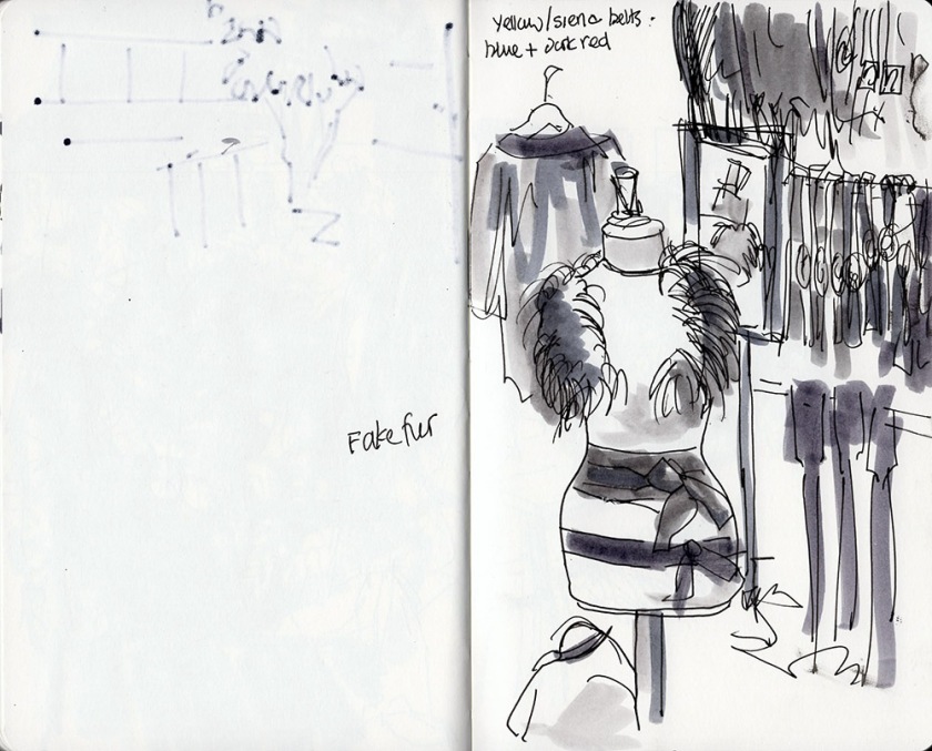
- People – Day 1 covered off place but the people were not drawn as characters and didn’t have enough detail. Not enough hipsters.
- Add more descriptive text possibly speech.
Day 2 – Brick Lane
Day 2 was a beautiful spring morning. I arrived at Brick Lane and not really knowing the market decided to walk the length of the road to soak up the atmosphere and look for likely drawing spots.
The market was getting busy. I sat in a cafe to gather my thoughts and reflect on how to go about drawing people.
My first sketch was a lady sitting in the coffee shop working on her laptop. I drew this using ink pen in a very comfortable familiar style; the same approach I use drawing commuters of the train. The sketches usually take about 10-minutes to complete.
After feeling warned up I ventured out into the crowded street. It was becoming a heaving mass of people and I no chance of drawing people successfully when they were continuously moving.
I found a discreet spot behind a book stall where I could stand and sketch. Most people interested in the books would spend a couple of thoughtful minutes searching through the boxes of paperbacks. This meant that even though they didn’t stay still I could at least work with the same subject.
My first attempt was a complete failure. I tried using the same 10-minute drawing approach that I’d used in the cafe. It was far too slow so I switched to fast drawing using Sharpies.
This seemed to work well and I was able to combine the strong expressive Sharpie lines with liquid watercolour brush pan to add tone. I ended up filling out the remaining pages of the sketchbook using this technique from the same spot.


Photographic reference


At this point I shared my visuals on the Site-wide Google Hangout in order to test opinion and gauge next steps.
Feedback from the group
The feedback was positive. My main takeaway was that many of the images do function in their own right and I needed to be careful about how much/what I choose to develop.
- The drawings stand alone and give a good impression of the place
- There is a risk of causing detriment to the images by doing further work ‘I’m not sure the images need developing further’
- Liked the portraits – they can stand alone
- Specifically like Brick Lane sketch 04 because of the bleed through from the other image
- Liked the hanging shirts in Spitalfields sketch 07. Liked the shirts hanging off the top of the page
- Not sure the images are hipster enough
With this insight I started the next part of the exercise.
Part 2 – Developing a narrative
My design thinking:
- Based on student and tutor feedback from the Google hangout many of the visual research sketches are strong enough to stand alone.
- ‘Hive of hipness’ could be achieved by simply combining people and place from existing sketches.
- I took inspiration from Lucinda Rogers – as well as having market scenes as subjects I really liked the quality of line in her drawings.
Inspiration – Lucinda Rogers
Narrative illustrations
The narrative illustrations were composited together digitally using Photoshop. The elements of SCAMPER used included:
- Substitute
- Put to another use
- Reverse
The emphasis when creating these illustrations was on process and experimentation rather than creating finished artwork.


Note that in parallel to Assignment 3 I completed a personal project Catálogo turístico with a people and place theme. Although the reference was not derived through primary research (but via video), this was a ‘real’ brief that was interesting to carry out as a complementary activity.
Compared to Assignment 3, where I had total control of my subject and time to explore and experiment, the Catálogo turístico subject felt constrained and remote; I fell back on more tried and tested illustrative approaches used in previous exercises to create the final illustrations.
It was interesting dealing with a ‘client’ in South America with no common language and a short deadline.
Development
I reworked one of the illustrations based on tutor feedback which suggested: It would have been good to see maybe another layer of background detail…. urban landscape around the outside of Spitalfields Market that can have been brought into the drawings more.
I drew the new background layer from photographic reference and composited this into the existing drawing. I do think this gives a greater level of depth to the image and also provides an anchor for the more expressive drawing of the market stalls and people.

Overall reflections
Questions
What were the main challenges you overcame when drawing in public places?
- Feeling self-conscious and worried about what people might think about my work
- Building a portable toolkit that works the way I create images
- Settling on sketchbook format (A5 portrait), that I can easily work with
Has drawing in your sketchbook altered the way you think about how you use photography to document or record?
- Very much so. Because I wasn’t really using sketching as my primary visual research tool I relied much more on photography to provide this information.
- Somehow I feel like I trust my own drawings more, or that they give me a view with feelings and associations attached. They’re already been filtered by me with some illustrative qualities applied.
What materials suited you best when you were working on location?
- I built my location sketching toolkit around a small canvas shoulder bag that is just large enough to fit an A5 sketchbook. I loaded the outside pocket of the bag with a limited selection of liquid watercolour brush pens, several of my favourite brand of ink pens and some black Sharpies. I also carried a paint brush, the type that contains a water reservoir.
- The limitations I’ve found so far are around the limited range of colours.
- I would like to try using a dip pen and ink on location but that will need a whole other toolkit.
Do you see your drawings as stand alone drawings or would you prefer to develop them in a studio situation?
- I think they can function as both. I’d like to be able to capture a subject so perfectly first time that they stand alone, but developing in the studio enables considered development of narrative and a broader range of media and materials that add to or change an illustrative interpretation.
- I like the process described by Pam Smy in research task 3.5 Visual research, where observational drawing is the start of an unconscious editing process that is built on and fine tuned in the studio.
How will you use your sketchbook drawings to lead to other ideas?
- The first and most obvious benefit of keeping sketchbooks is the growing archive of ideas, snippits, successes, failures and mistakes that are available for me to draw on and reference. Because I’ve made them in some way they are more firmly lodged in my memory for reuse later.
- SCAMPER is a good process driven way to try things out and encourages experimentation using existing imagery. Digital manipulation using multiple Photoshop layers is an excellent way to push new thinking.
- I really liked the idea of using adjectives or a short written description to describe the kind of effect an image should achieve. This was a powerful way to explain what an ‘illustrative interpretation’ means. I’ll use this approach as an overarching guide in future projects.
Do you prefer working fast or slow? How will you use these approaches in future work?
- Before starting Illustration sketchbooks I completed Printmaking 1. Printmaking as a discipline is (mostly) quite process driven and ‘slow’. Whilst I really enjoyed the course, I’ve really enjoyed the relative freedom of sketching and love the fact that I can create an image in a couple of minutes.
- For Assignment 3 I enjoyed both the fast drawings of people from Brick Lane and the slower drawings from Spitalfields Market. I don’t think I have a preference although there are definitely situations (such as figure drawing in a busy market), where a particular technique is more effective.
- My aim for the future is the continue to develop different approaches with different materials and to broaden my range of responses for capturing what’s in front of me.
Are there qualities in the way you doodle that you can bring into your ideas within future work?
- There are a number of qualities that I noticed during 3.5 Free association that I will use:
- Increased use of repeat pattern filling empty space
- Even density of imagery across the page with a lot packed into a small space
- Unconcern for spatial relationships
- A dreamlike surreal quality
Feedback from PART 2
I received the following pointers for next assignment in my PART 2 tutor feedback.
| Comment | Response |
| Using different implements or materials to visualise different old and modern surfaces or textures (brick, steel, etc) | I continued this experimentation building on work completed in PART 2 into the Illustrative drawings in 3.3 Illustrative drawings and 3.4 Interpretation & communication |
| Rapid and slower drawing in combination to create a sense of temporality (time passing) in spaces, buildings and objects (buses, tubes) | Rapid and slow drawing techniques were explored and used extensively throughout PART 3. The exercises started to help shape where and when to deploy each technique. Assignment 3 is probably the best example, where rapid sketches of people in a busy market are contrasted against slower drawings of market stalls and architecture
|
| Bringing lots of smaller sketches into larger, more finished pieces in the studio (like John Virtue’s approach). | Assignment three does just this. Location drawings and sketches were combined digitally to create new meaning |
