
The brief was to create two images to be used within a campaign for a supermarket, to package and promote a range of seasonal foods.
Keywords and phrases from the brief:
- Focus on research, gathering and evolving ideas
- Images will be used within a campaign for a supermarket
- Promote a range of seasonal foods
- The supermarket is respected for quality
- They want to promote this notion of quality
- Point of sale display
- Sited near the fruit and vegetables
- Final reproduction size will be 12 x 12 inches
- Create an illustration of fruit or vegetables for each of the ranges: Summer, Autumn
- Images should be objective, based on direct observation
- Create separate images for Summer and Autumn that reflect both the produce and aspects of the season itself
Approach
The process I used was:
- Research
- Objective drawings
- Draw up and choose ideas
- Consider composition and content
- Work up visuals
- Create final artwork
Each step in the process is described in more detail below.
Research
The Assignment 2 brief emphasised that the final point-of-sale illustrations should promote a notion of quality but didn’t specify what this means. To understand this clearly I carried out some competitor analysis against three major supermarkets:
- Marks & Spencer
- Waitrose
- Sainsbury’s
Initially I used the internet to pick out key information from the supermarket’s websites (both corporate and retail sites), and put them into visual mindmaps:


In parallel, I visited a typical store for each brand and photographed current point-of-sale displays.


The research gave me a good insight into how the ‘upmarket’ supermarkets portray a sense of quality to their customers including:
- Visual style and tone-of-voice
- Points of differentiation
- Points of similarity (there were a striking number of these)
- Positioning of point-of-sale collateral within the stores
This allowed me to develop the brief; I picked out key findings – images, key words/phrases that capture the essence of what needed to be conveyed.

I then brainstormed and created mindmaps for the keywords and phases:


Further to this I carried out customer research. I found qualitative and quantitative data relating to Waitrose customers and I used this to create several personas.


This told me alot about customer likes and dislikes; this was to influence my final choice of subjects and visual style.
Through my research, I created an imaginary marketing campaign based around the theme of ‘In Season’. My illustrations would form part of the materials to support that campaign.
My final piece of research involved looking at the work of contemporary illustrators for inspiration.
I looked at the work of:
- Sharif Tarabay
- Liam O’Farrell
- Michael Frith
- Rosie Sanders
- Rosie Sanders
- Roger Kent
I finally settled on fruit and vegetable illustrations by Marta Spendowska


I picked these because the ‘painterly’ watercolour visuals and personalised handwritten approach to the captions fitted well with the idea of quality held by the supermarket’s target customers.
Objective drawings
The brief was very specific: Images should be objective, based on direct observation
It wasn’t possible to find fresh summer and autumnal fruit and vegetables in the middle of winter so my choices were limited to what I could buy in supermarkets i.e. not fresh from the ground/no foilage.
Based on my competitor analysis, I wanted the fruits and/or vegetables to be ‘British grown’. I selected four ‘in season’ British fruits and vegetables and started by doing objective pencil drawings of each:


I worked up several of the drawings using different techniques and styles and this initial experimentation shaped my thinking around what and how I developed ideas.


Draw up and choose ideas
I drew a number of thumbnails that explored content combinations and visual approaches to introduce aspects of each season into the illustrations:


Consider composition, content
Each point-of-sale display would:
- Be created at final size (12” x 12”) at 300dpi using CMYK colour reference
- Include a heading (the name of the subject)
- The ‘In season’ logotype
- The illustration (I hadn’t decided which visual approach to take at this point)
- A sentence of supporting text to provide an interesting/engaging fact related to the subject
- Seasonal colour from a pre-defined swatch would be used to introduce the seasonal element into the picture
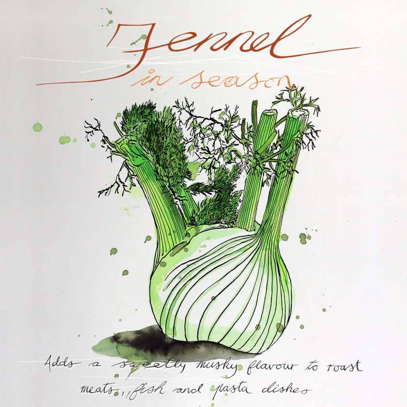
The content for the two final pieces of artwork would be:
- Cucumber or tomatoes for summer
- Fennel or field mushrooms for autumn
Work up visuals
I selected and developed several the objective drawings using three different approaches:
- Pen & ink and watercolour
- Illustrator (tight and detailed)
- Illustrator (lose and simple)
It was interesting to compare the different feel that each visual approach gave to the same underlying drawing.


I also did a lot of experimentation with handwritten text which was an important visual ingredient.

Create final artwork
The final artwork was created by compositing the different elements together and adding additional textures and other effects in Photoshop.
I used colour from the Summer and Autumn colour swatches to reflect each season.

I worked up three final pieces (one for summer and two for autumn) and have included them all.


What I learned from the assignment
What went well
- I was concious of the comment/feedback from my last assignment which was for me to work more in my sketch book and allow ideas to develop. I thought I did this for Assignment 2.
- Spending quite alot of effort on researching different supermarkets and their customers provided good context and helped me meaningfully interpret the brief.
- Looking through the portfolios of contemporary illustrators helped me shape my own ideas.
- I enjoyed working with a combination of pen and ink and liquid watercolour – the lose feel worked well in the final illustrations.
- It was nice to work with soft pencil on heavily textured watercolour paper – I like the texture and feel of the drawings.
What I would do differently/better
- I did look at Dutch vermeer painters and initially wanted to explore glazing techniques to get a real feeling of juicy lusciousness into the pictures. I didn’t progress with that idea but will explore it at some point in the future.
- I couldn’t get hold of fresh summer fruit and vegetables (give it’s the middle of winter), and it would have been nice to have some additional foilage and greenery to add colour and texture to the pictures.
